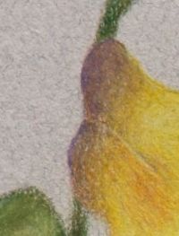
Too much color on edge of petal
OK, let’s analyze the problem. Seems to be to much color, the purple, and too much of a value change. It appears that a wee bit too much of the purple was added in the second layer.
On these petals that are outside the center of interest, Beige was laid down over the entire petal to begin with, then Violet, then Sunburst Yellow. The petal edge is presenting itself as purple which means that even with an overlay of Sunburst Yellow the color did not neutralize.
If we add more color in layers over the top, trying to *fix* this, we will have one petal edge that is more burnished than any of the others. At this point, it might be wise to remove the purple area entirely, either with a kneaded eraser, or gently with an electric eraser and start again.
The second layer should be applied really, really lightly and the end result should be a coolish, neutralized yellow and not purple. I quite like some cool accents throughout a painting so often leave them if they show as ‘slightly’ purple, but they should be interesting and not distracting.

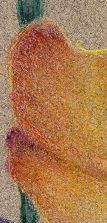
My Petal
Not only is there a value problem here, the purple is too dark against the background but also a temperature problem as the Sunburst Yellow has warmed it up. It needs to more closely match the cool grey background in both value and temperature so going over the final yellow with a cool grey might be very attractive. Choose a cool grey that matches the value of the paper. Do let us know how this goes and don’t hesitate if you have more questions.
More later on why I chose to use complements for this project.
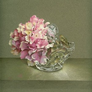 Still working on the tabletop but had to take a break. My fingers never ache as I have a very light touch but my shoulder freezes. 🙂
